01Why Is There No Single Best-Practice Product Page?
The ecommerce internet is full of "perfect product page" templates. They share the same layouts, the same element ordering, the same trust badge placements. They are wrong—not because the individual elements are bad, but because they assume every product and every customer requires the same persuasion architecture.
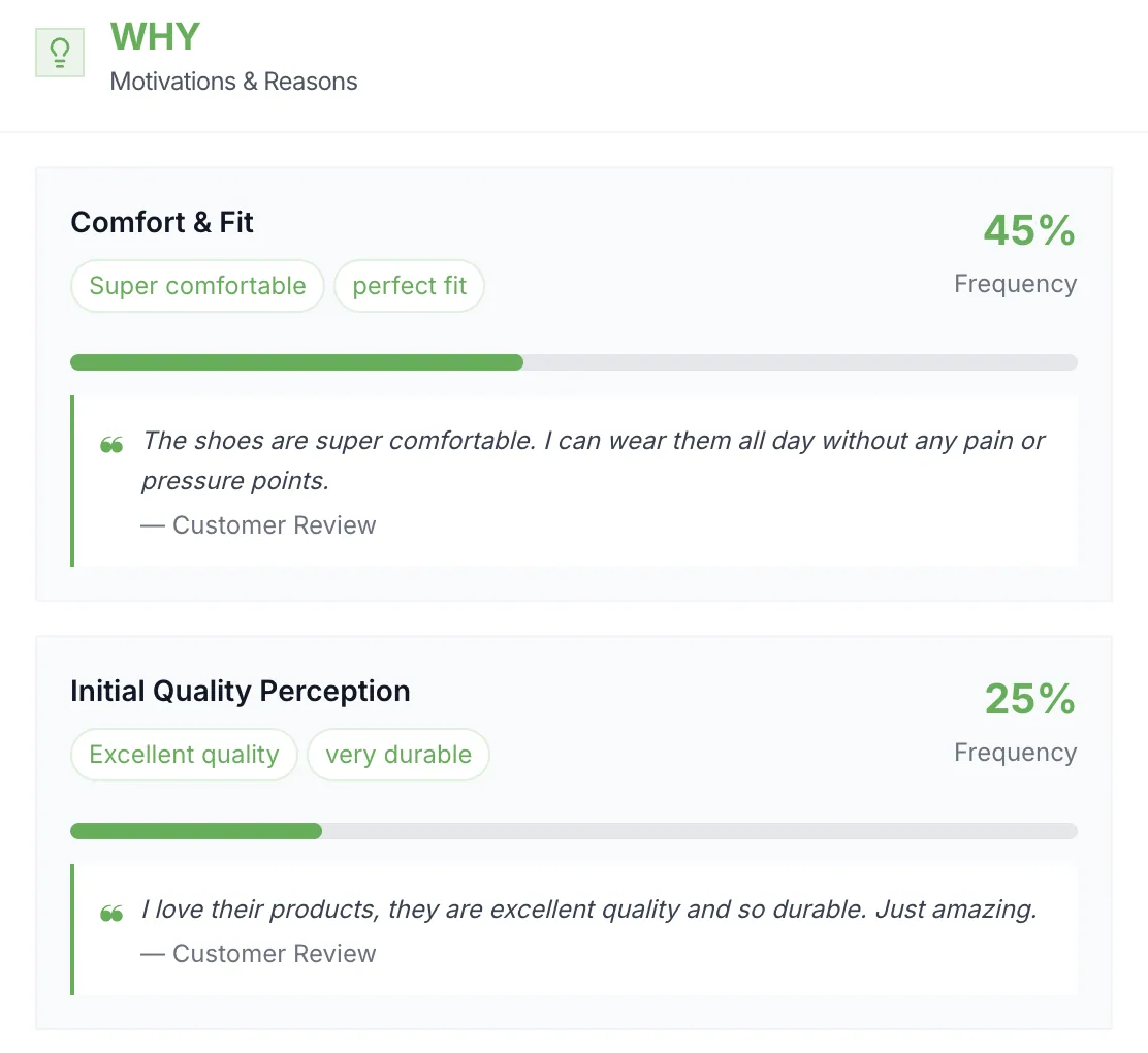
At DRIP, Fabian's design philosophy starts with the customer's primary objection. For activewear, the objection is fit. For wellness equipment, it is efficacy. For fashion basics, it is quality at the price point. The PDP needs to resolve that specific objection faster and more convincingly than the customer expected. Everything else is secondary.
What follows is an element-by-element analysis of PDP components, each backed by at least one A/B test from a real brand. Use them as hypotheses for your own testing program—not as rules to copy blindly.
02How Much Do Product Images and Video Affect Conversion?
Product imagery is the first thing visitors engage with, yet most brands treat it as a creative decision rather than a conversion one. The question is not whether your photos look good. It is whether they resolve the customer's primary concern before they start scrolling.
This does not mean one image style is universally better. For technical products like Blackroll's, where the benefit has to be understood or demonstrated, clear product shots or video that show the use tend to help. For a basic apparel product where fit is the main concern, a clear lifestyle image or size reference photo may outperform video because it delivers the answer faster.
Image strategy by product type
- Technical / functional products: Video or GIF demonstrating use. Place above the fold. Static images supplement but do not replace.
- Fashion / apparel: Lifestyle imagery showing fit on body. Model diversity matters for conversion. Size reference images beat product-only shots.
- Commodities / consumables: Clean product shot with context (e.g., packaging next to a recognizable object for scale). Speed over richness.
03Which Price Display and Trust Elements Actually Increase Revenue?
Price presentation and trust elements are the most over-templated parts of the PDP. Agencies copy what works on Amazon and paste it onto DTC stores without considering that Amazon's audience expects discounts while a premium brand's audience expects quality justification.
Price display: anchoring and absolute savings
We also tested reference pricing—showing the original price crossed out next to the discounted price. This created an anchoring effect that increased perceived value. The combination of a visible reference price with absolute savings ("EUR 59.90 crossed to EUR 47.90 — Save EUR 12") consistently outperformed percentage-only displays.
Premium quality highlights
When a product competes against cheaper alternatives, a visible quality highlight reframes the price as justified rather than expensive. For Giesswein, a prominent "100% Merino Wolle" badge on the product page, placed as a quality indicator rather than an eco label, added EUR 232,500 per month in revenue. It worked because research had identified initial quality perception as the top purchase driver.
04How Should You Optimize Size Guides and Variant Selectors?
If you sell apparel, accessories, or any product with size variants, the size guide is likely your highest-leverage PDP element. Not because it is the most visible, but because size uncertainty is the primary reason customers abandon product pages.
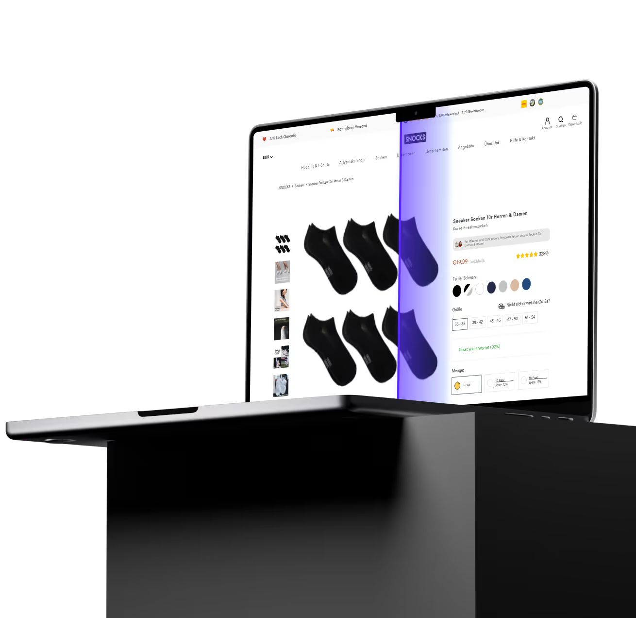
Expect the effect to scale with fit anxiety. For products with more standardized sizing, such as socks or underwear, baseline uncertainty is lower, so a sizing tool has less to resolve than it does for activewear with non-standard sizing.
Variant selector design
Beyond sizing, the variant selector itself—color swatches, material options, bundle configurations—affects conversion through cognitive load. Our general findings across multiple brands:
- Show available sizes/variants as visual swatches rather than dropdowns. Dropdowns hide options and add clicks.
- Cross out unavailable sizes visually (strike-through, greyed out) rather than removing them. Removal confuses returning customers.
- Pre-select the most popular variant rather than forcing a selection. This reduces decision friction for the majority.
- For products with 8+ variants, group them logically (by color family, by collection) rather than displaying a flat list.
05Do Comparison Tables and Accordions Help or Hurt Product Pages?
Comparison tables and content accordions are structural elements that organize information density. They do not add new content—they change how existing content is presented. That presentation decision has measurable revenue implications.
Comparison tables: self-selection beats persuasion
The comparison table works because it shifts the decision from "should I buy?" to "which one should I buy?" This is a classic nudge from choice architecture. By presenting the alternatives within your own product range, you prevent the customer from leaving to compare across competing brands.
Accordion implementation
Accordions consolidate product details (materials, care instructions, shipping, returns) into collapsible sections. The test data is more nuanced than most teams assume:
- Accordions above the fold: Generally negative. Hiding critical purchase information (shipping, returns, materials) behind a click reduces conversion when the content is decision-relevant.
- Accordions below the fold: Generally positive. Structuring supplementary content (care instructions, detailed specs, brand story) into accordions reduces visual clutter without hiding purchase-critical information.
- Default-open first accordion: A reasonable middle ground. The most important section (often product description) is expanded by default, while secondary sections are collapsed.
06Should You Remove Breadcrumbs and Navigation Elements from PDPs?
Navigation elements on the PDP represent a tension between two goals: keeping visitors oriented within your site, and keeping them focused on the purchase decision. Every link above the fold is a potential exit from the conversion funnel.
Breadcrumb removal tests have shown small but consistent positive effects on conversion for brands with shallow category structures. When the PDP is the primary decision page—as it is for most DTC brands with fewer than 200 SKUs—breadcrumbs serve navigation at the expense of focus.
For larger catalogs (500+ SKUs) with deep category hierarchies, breadcrumbs provide orientation that prevents frustration. A customer browsing 40 types of running shoes needs to know where they are. A customer on a DTC brand with 12 products does not.
| Factor | Remove Breadcrumbs | Keep Breadcrumbs |
|---|---|---|
| SKU count | < 200 SKUs | 500+ SKUs |
| Category depth | 1–2 levels | 3+ levels |
| Traffic source | Primarily direct / paid | Primarily organic / browse |
| Purchase journey | Single-product focus | Comparison shopping |
| Brand type | DTC with narrow range | Marketplace / wide catalog |
Regardless of breadcrumbs, evaluate every navigation element above the fold. Menu bars, promotional banners, and category links all compete for attention with the add-to-cart action. The PDP should have a clear visual hierarchy that drives the eye toward the purchase action, not toward exits.
07How Should You Prioritize PDP Optimization Experiments?
With over 20 testable elements on a single PDP, prioritization is everything. Running the wrong test first is not failure—it is opportunity cost. The test you did not run might have produced a larger lift.
A prioritization framework
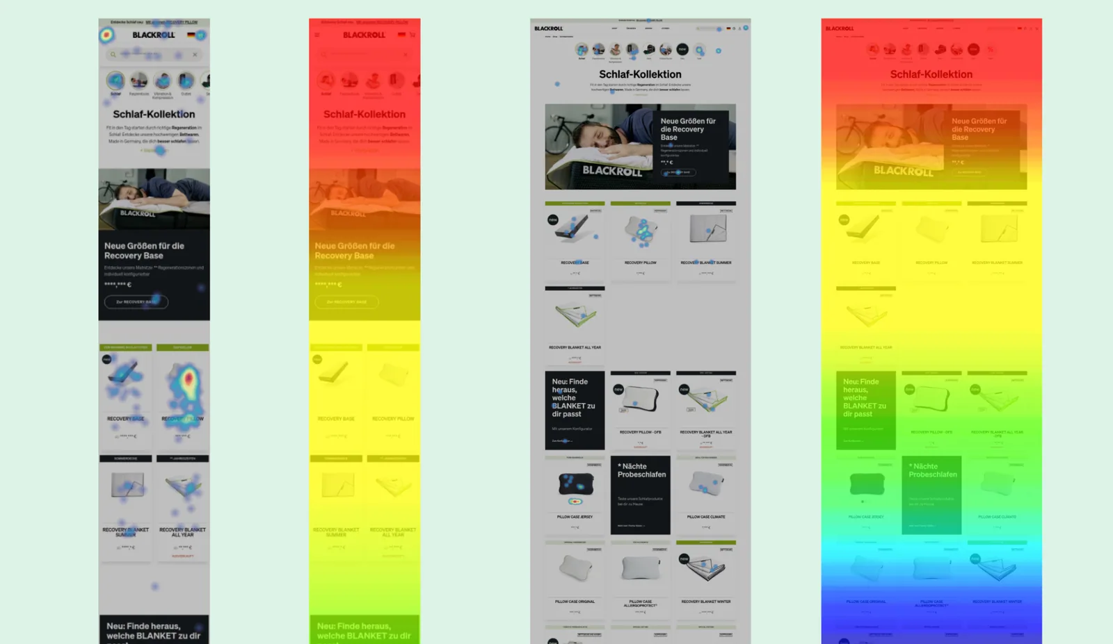
- Identify the primary objection. Survey post-purchase customers. Read return reasons. Analyze heatmaps for where scroll depth drops. The primary objection is whatever stops the most people from buying.
- Test the element that resolves it. If the objection is fit: size guide. If the objection is price justification: quality highlights. If the objection is decision paralysis: comparison table.
- Move to secondary friction points. Once the primary objection is resolved, the secondary objections become visible in the data. Work through them in order of impact.
- Test structural changes last. Layout rearrangements, navigation removal, and accordion implementations are lower-impact in isolation. They matter most after the content itself is optimized.
| Test | Brand | Result | Element |
|---|---|---|---|
| Numbered product shots for attachment heads | Blackroll | +10.4% RPU | Images / Media |
| "100% Merino Wolle" quality badge | Giesswein | +EUR 232,500/month | Trust / Persuasion |
| Focused promise section (trial, warranty, returns) | Blackroll | +5.5% RPU | Trust / Persuasion |
| Absolute savings display | Blackroll | +1.8% RPU | Price Display |
| Interactive size guide | Oceansapart | +8.0% CR, +10.0% RPU | Size Guide |
The theme across all these tests is specificity. Generic "best practice" changes—adding a badge, changing a button color—rarely produce significant results. Specific, hypothesis-driven changes that resolve a documented customer objection produce measurable revenue impact.
Want a product page that converts? See if your shop is a fit→