A/B Test Patterns That Consistently Win
We've run 4,000+ A/B tests across 250 European DTC brands. Most test ideas don't move the needle, but 5 patterns show up as winners consistently. The one that surprises people most:
Free. Five quick questions, then it's yours.
What's inside
What you get
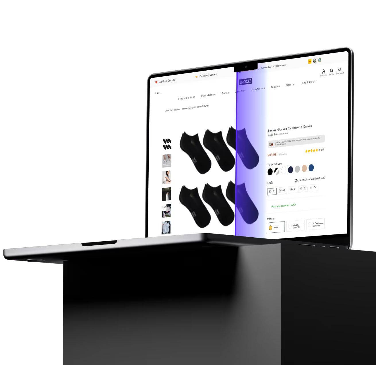
We removed a feature from a client's product page and added €19,000/month.
The sticky add-to-cart button: gone.
A textbook CRO recommendation: gone.
Revenue up.
Because at high-intent moments, every extra decision is a drop-off risk.
Less friction isn't about removing value, it's about removing noise.
The other 4 patterns follow the same logic:
Specific is better than vague.
Aligned works more than generic.
Framed well wins over technically correct.
I wrote up all 5 with the real test data behind each one.
𝗜𝗳 𝘆𝗼𝘂’𝗿𝗲 𝗿𝘂𝗻𝗻𝗶𝗻𝗴 𝗮 𝟳-, 𝟴-, 𝗼𝗿 𝟵-𝗳𝗶𝗴𝘂𝗿𝗲 𝗲𝗰𝗼𝗺 𝗯𝗿𝗮𝗻𝗱 𝗮𝗻𝗱 𝘄𝗮𝗻𝘁 𝘁𝗵𝗶𝘀 𝗳𝗿𝗮𝗺𝗲𝘄𝗼𝗿𝗸:
1\. Like this post
2\. Comment “5” or "FIVE"
and I'll send it to you.
Not sure where your shop leaks?
Book a call and we'll tell you where the money gets lost and what to test first.
Get the free copy
Answer five quick questions and the link is yours.
Step 1
Step 2
Step 3
Step 4
Step 5
What's your email address?
The CRO agency behind 250+ of the world's leading online businesses
Whether high-growth startups or global leaders in e-commerce, travel, insurance, or retail, we consistently drive measurable revenue increases.

















Spend the same on ads.
Make more from them.
Book a call with the team and tell us about your shop. We'll talk through where it stands, where you want it to go, and how we'd get you there. If working with us isn't the best return on your money, we'd tell you rather than take it.
30 minutes, and you'll know exactly where your shop stands.
The Newsletter Read by Employees from Brands like